Parlour was shortlisted as Creative Directors for the Australian Pavilion at the 2016 Venice Architecture Biennale. We have now presented our stage 2 proposal to the Venice Biennale Committee.
We will publish the full proposal in due course. In the meantime, we are pleased to show you a little of what we have been up to. (The team is Justine Clark, Naomi Stead, Maryam Gusheh, Catherine Griffiths and Fiona Young.)
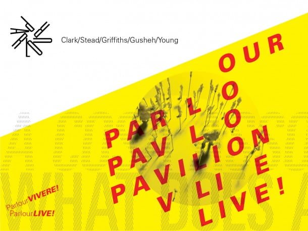
ParlourLIVE! is a contemporary snapshot of the human story of Australian architecture—a powerful documentation of who the profession is, how it works and how it might become more robust and inclusive.
ParlourLIVE! is an instrument for collecting, exhibiting, and discussing live research. It generates a new picture of the profession and helps debate what it might become.
ParlourLIVE! is a forum for advocacy. It draws on the collective imagination of the entire Australian architecture profession to project a better future for all. It builds on existing Parlour research that shows that a more diverse and equitable profession is also stronger, more inventive and more sustainable.
ParlourLIVE! is research in action. It is also research that demands action. It prompts the viewer to ask “What about me?”, “Where do I fit?”, “What do I contribute?” and “What can I do?”
ParlourLIVE! asks the audience: what is the shape of the profession? How might you like that to change?
Visitors leave ParlourLIVE! with the knowledge that Australia is a leader in the campaign for equity in architecture. They take with them new knowledge, new resolve and practical tools for advocacy and action.
Exhibition strategy
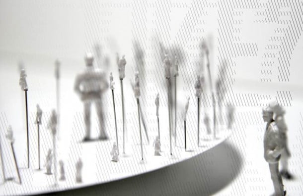
MEET the architect—what does an architect look like?
Every Australian architect has the chance to have their 15 seconds of fame at the 2016 Venice Biennale.
ParlourLIVE! is radically inclusive. It challenges stereotypes of who can be an architect and what the profession looks like through the collection of tiny ‘real’ architects, accompanied by their individual stories.
Celebrating the often-unrecognised diversity of people and roles that already exists in Australian architecture, these miniatures fascinate the audience—local and international, architects and others—building empathy and connection.
REFLECT on the profession—beautiful data
Data and infographics provide a fascinating, detailed reality check, rewarding both a glance and a long examination.
ParlourLIVE! builds on a base of compelling, carefully prepared research. It asks Who are the people of Australian architecture? Where and how do they work? What do they look like? What motivates them and frustrates them? What might the future of the profession be? How could it be more equitable? This rich picture of how architects work, think, and practice in Australia is transported to Venice, where it is extended by new, comparative international data. This provides a collective picture—statistics and infographics are complemented by accumulated stories and images.
ACTIVATE change—a space to speak
ParlourLIVE! transforms the Australian pavilion into a live workshop on altering architecture for the better—as a workplace and a profession. There are numerous ways to participate: visitors leave energetic, optimistic, and armed with the impetus for change.
Exhibition design
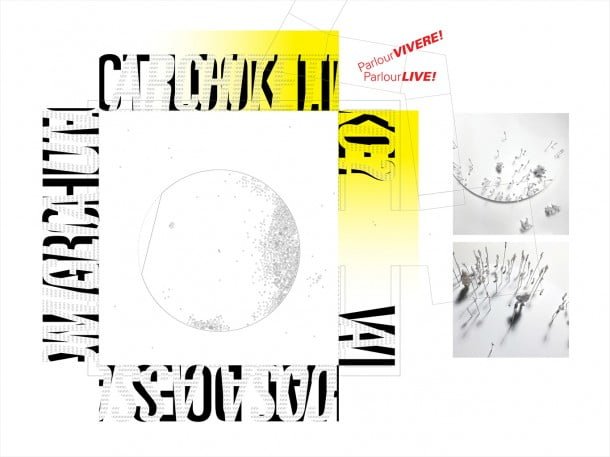
A raked circular platform hovers within the square plan of the Australian pavilion. 3-D printed models of Australia’s architectural community cluster on the edges of the platform, mapping the location of major cities (all fall onto the arc) and of smaller towns and regions (Alice is in the very centre.)
On the walls, fragmented floor-to-ceiling typography asks: WHAT DOES AN ARCHITECT LOOK LIKE? A COSA ASSOMIGILIA UN ARCHITETTO?
The typography challenges the legibility of the question, while also providing a frame for the answer. This is found in the detail—the information and data, the stories, the projected visualisations, the narratives—that complement the elevated clusters of tiny figures in the centre of the room. The walls of the pavilion become an active three-dimensional site for the presentation, collection and dissemination of data and stories.
Over the life of the Biennale, visitors add their own information, and take away new tools, resources and data—the walls become giant pin/peg boards. Dashed markings indicate places to hang, peg or slot, information and data, while the solid shapes, positive and negative, provide space for texts.
Exhibition experience
Captivated, Biennale-goers wander among the myriad miniature architects—momentarily becoming part of the exhibition as they peer intently at individual figures or watch the large-scale projection on the back wall.
Resting weary feet, they take a moment to document their own stories and data. (In event mode, the platform becomes the seating from which to watch the action).
Drawn around the circular platform to the ever-changing walls, visitors add their own information to the accumulating material. Pausing to peruse the content more closely, they pick up a stunning poster or postcard emblazoned with activist slogans and startling analysis.
After the Biennale these posters populate architectural offices around the world (as do the Parlour Guides to Equitable Practice).
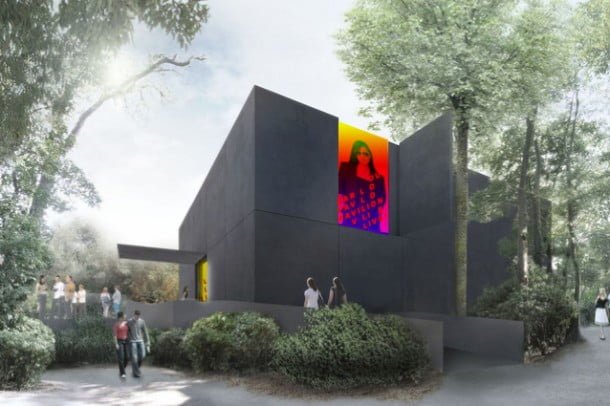
We would like to thank BVN for the wonderful support they provided in developing this project.
