Catherine Griffiths, of Studio Catherine Griffiths, designed the Parlour identity design and typography. She describes the ideas explored.
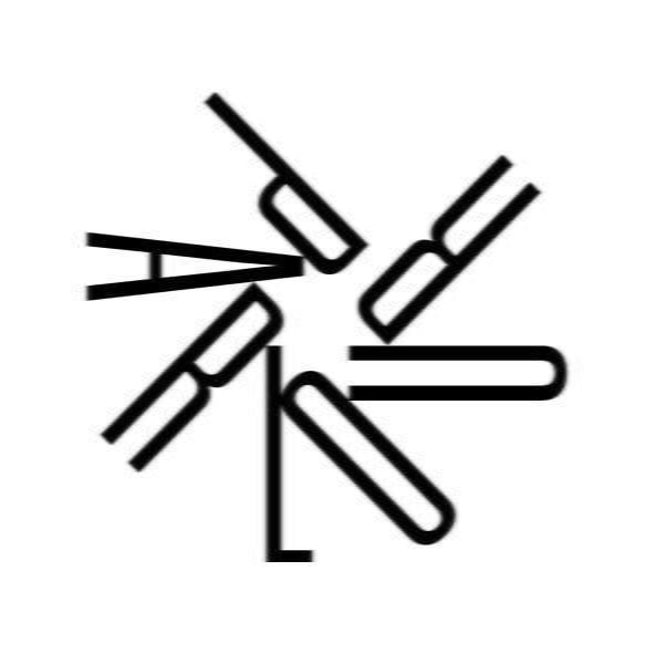
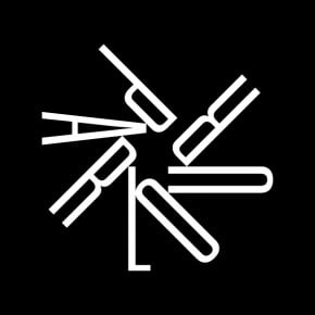
The typographic composition of the PARLOUR ‘asterisk’ references the architectural voice of women (parler/parlour) in a discipline where fine minds and skills are honed to converge/diverge, make marks, make change towards a new movement. The strapline, together with punctuation, is set matter-of-factly: stating the point.
The logotype is composed in the finest weight of Univers: 39 Thin Ultra Condensed, designed by Adrian Frutiger in 1954.
The strapline
: women, equity, architecture.
is set in Typewriter, which exists in three weights only, with no italic. Typewriter was designed by Henrik Kubel and Scott Williams of A2-Type, London, and released in 2011. It is based on an original Olivetti Letterer 22 typewriter, discovered when they moved into their new studio, which they used to make a typed proof that was subsequently digitised.


1 comments
studiocatherine says:
May 18, 2012
While constructing, I was surprised to discover how geometric the sequence of letterforms P-A-R-L-O-U-R are in this circular formation. The ‘R’s are head to head; The ‘A’ is megaphone-like; the ‘L’is a strong and noble nose, and anchors the composition; the ‘U’ is perhaps a magnet; you could tap the ‘P’ and the whole thing could start up in motion! Parlour / Parler, an asterisk, a colon, a full-point (period, full-stop) — the conversation is already underway!